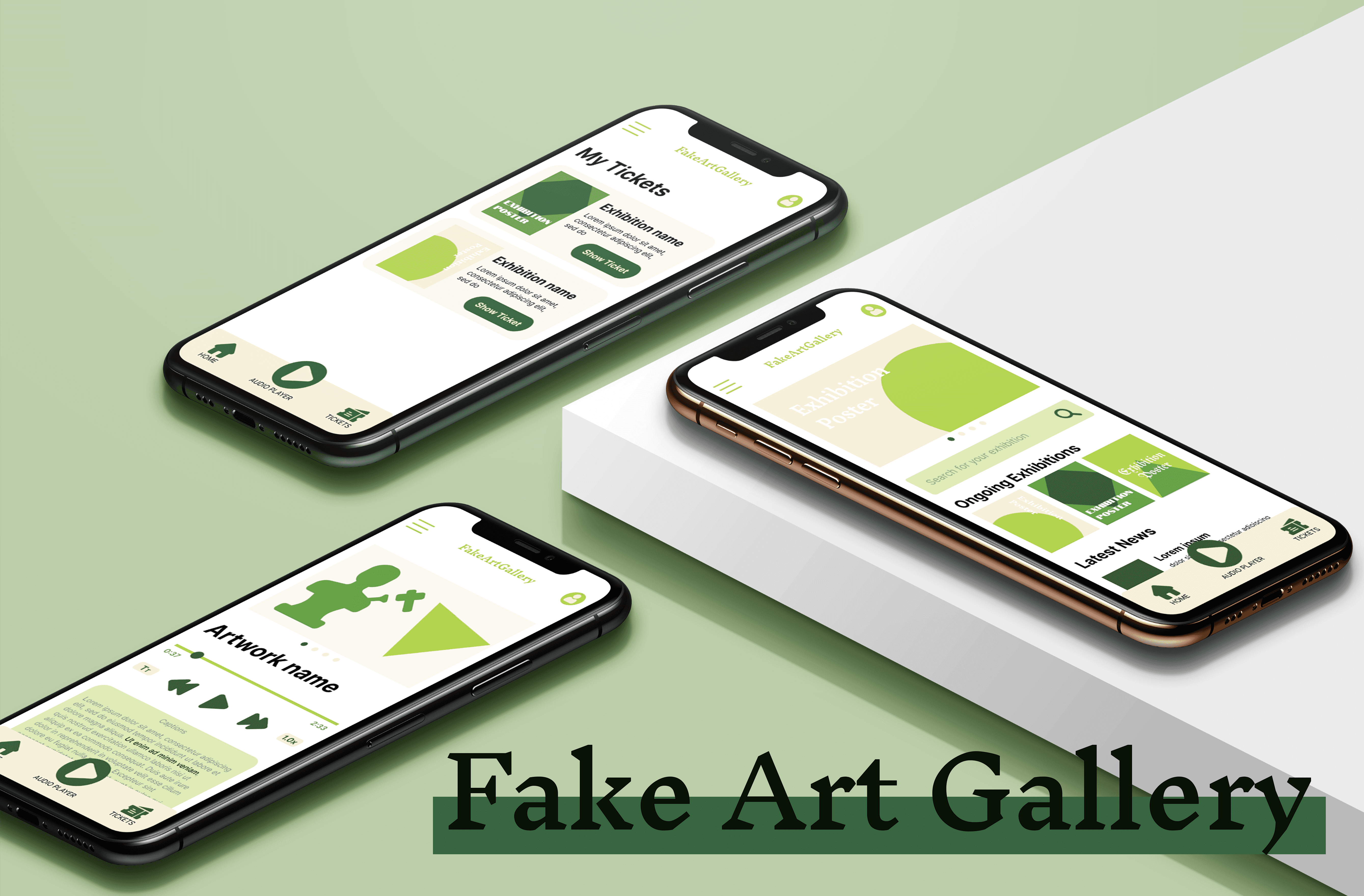
Project Overview
Project Overview
Many art visitors struggle with engaging meaningfully with art collections due to overwhelming choice and lack of contextual understanding. Without guided experiences, they miss opportunities to fully appreciate the artistic and historical significance of artworks.
Fake Art Gallery offers century-old expertise and curated audio tours that guide visitors through our vast collection. Our accessible experience empowers visitors to discover meaningful connections with art across centuries, from Renaissance classics to contemporary works.
Role: Product Designer, UX Researcher, UX/UI Designer
Role: Product Designer, UX Researcher, UX/UI Designer
Duration: September to October 2023
Duration: September to October 2023
Responsibilities: Product Strategy, User Research, Interaction, Visual design, Prototyping & Testing
Tools: Figma, Adobe Photoshop, Miro, pen and paper
Tools: Figma, Adobe Photoshop, Miro, pen and paper
Process
Process

Click the table to enlarge
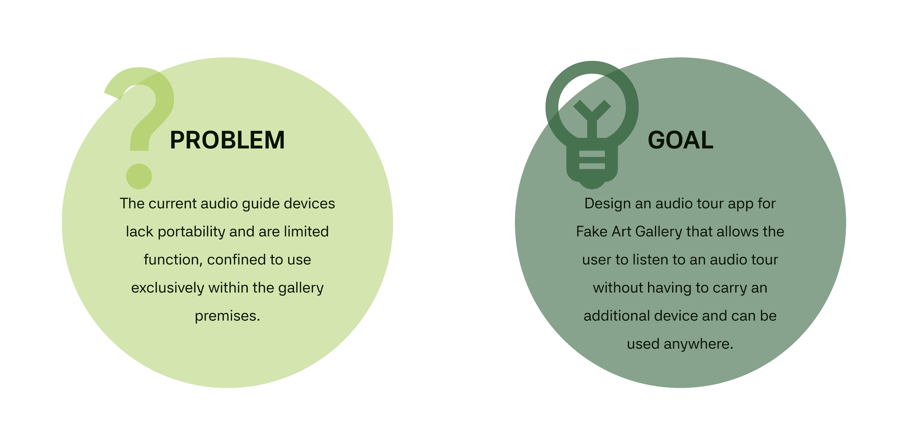
Problem & Goal
Problem & Goal
Click the table to enlarge

Discover
Discover
User Research
Through interviews and empathy mapping, our research identified five key user segments for the audio guide app: art enthusiasts, tourists, students, families, and art professionals.
While these findings validated our initial audience assumptions, they revealed multiple pain points beyond just device portability. Users struggled with accessibility limitations, tedious rental processes, and inflexible pricing models—all significant factors in their decision to utilize audio tours.
Pain Points
Pain Points
To better understand the results of the user research, I summarized the following 4 pain points.
To better understand the results of the user research, I summarized the following 4 pain points.

Define
define
Personas
Personas
To bridge research and design, I created two personas representing our gallery visitors' core needs and pain points. These archetypal users guided our decision-making process, ensuring our solutions addressed real challenges identified during user research.
To bridge research and design, I created two personas representing our gallery visitors' core needs and pain points. These archetypal users guided our decision-making process, ensuring our solutions addressed real challenges identified during user research.
Persona #1
Nancy Kim
55y/o Restaurant Owner - Wisconsin, US
Nancy is a restaurant owner balancing her successful Mexican restaurant with family life after remarrying last year. She has presbyopia, making it difficult to see small text. Though she owns a smartphone, she's not tech-savvy and finds new applications challenging. She wants to enjoy art during her newfound leisure time but struggles with traditional audio tours.
Goals
To appreciate art at her own pace without technology frustrations.
To learn about art history to develop her new hobby.
To share art experiences with her family during quality time together.
Challenges
Limited tech proficiency makes complicated interfaces intimidating.
Vision difficulties prevent her from reading small exhibition text.
Time constraints as she balances business and family responsibilities.
Needs
Accessible interface with adjustable text and audio settings.
Simple, intuitive controls that require minimal technical knowledge.
Flexible usage options that allow for varying visit durations.
Multi-user capability to share discoveries with family members.
Clear audio narration that compensates for reading difficulties.
Persona #2
Jacob Moreau
22y/o Junior Data Scientist - Lyon, France
Jacob recently moved to pursue his career as a junior data scientist. Despite adequate English for daily use, his French accent makes communication challenging. As a photography enthusiast, he visits art exhibitions to gain inspiration and meet like-minded people, but language barriers limit his ability to fully engage with art content.
Goals
To understand artwork context despite language barriers.
To connect with the local art community through shared experiences.
To revisit tour content later for deeper appreciation and sharing.
Challenges
Language limitations when audio tours are only in the local language.
Social anxiety makes asking for assistance uncomfortable.
Budget constraints as he saves for photography courses.
Needs
Multi-language support with easy language switching.
Adjustable playback speed to better comprehend explanations.
Content saving feature for reviewing after gallery visits.
Shareable content to discuss with friends and photography community.
Cost-effective solution that works with his limited budget.
User Journey Map
User Journey Map
To understand pain points in the gallery experience, I mapped Nancy's journey across five key stages—from ticket purchase to departure. The map reveals frustrations with the current ticket buying process, navigation challenges, device rental complications, manual audio entry for artworks, and the inconvenience of returning equipment. These insights guided our improvement opportunities, showing where digital solutions could significantly enhance the visitor experience.
To understand pain points in the gallery experience, I mapped Nancy's journey across five key stages—from ticket purchase to departure. The map reveals frustrations with the current ticket buying process, navigation challenges, device rental complications, manual audio entry for artworks, and the inconvenience of returning equipment. These insights guided our improvement opportunities, showing where digital solutions could significantly enhance the visitor experience.

Click the table to enlarge
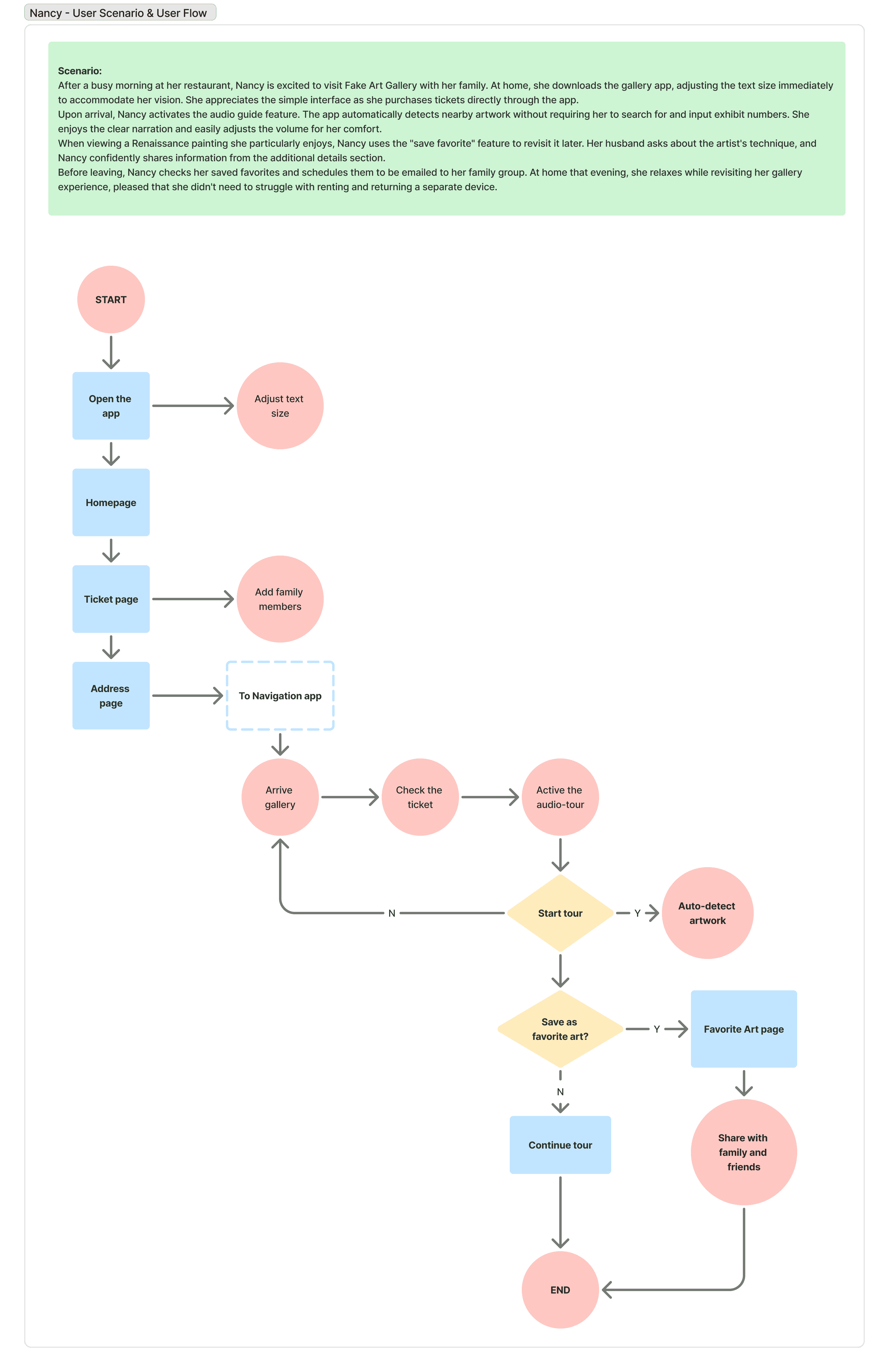
User Story & User Flow
User Story & User Flow
After completing the user research, I illustrated a user story for Nancy's persona to show the main features of the gallery app and mapped the corresponding user flow. This visualization helped translate our research findings into actionable design requirements focused on accessibility and simplicity.
After completing the user research, I illustrated a user story for Nancy's persona to show the main features of the gallery app and mapped the corresponding user flow. This visualization helped translate our research findings into actionable design requirements focused on accessibility and simplicity.
Persona #1 - Nancy
Persona #1 - Nancy

develop
develop
Wireframe
Wireframe
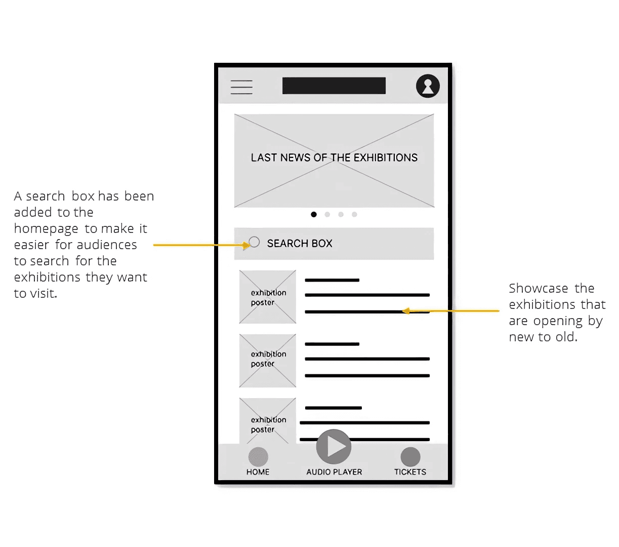
As part of the development phase for the Fake Art Gallery project, I created a series of wireframes to visualize the user experience and spatial layout. The wireframing process began with hand-sketched paper prototypes that allowed for quick iteration and conceptual exploration. These initial sketches focused on establishing the basic navigation flow and content hierarchy without being constrained by digital tools.
As part of the development phase for the Fake Art Gallery project, I created a series of wireframes to visualize the user experience and spatial layout. The wireframing process began with hand-sketched paper prototypes that allowed for quick iteration and conceptual exploration. These initial sketches focused on establishing the basic navigation flow and content hierarchy without being constrained by digital tools.


After refining the paper wireframes, I transitioned to digital wireframing using industry-standard design software to create more precise and detailed representations.
The progression from paper wireframes to digital mockups demonstrates the iterative design approach and showcases how the gallery concept evolved throughout the development process.
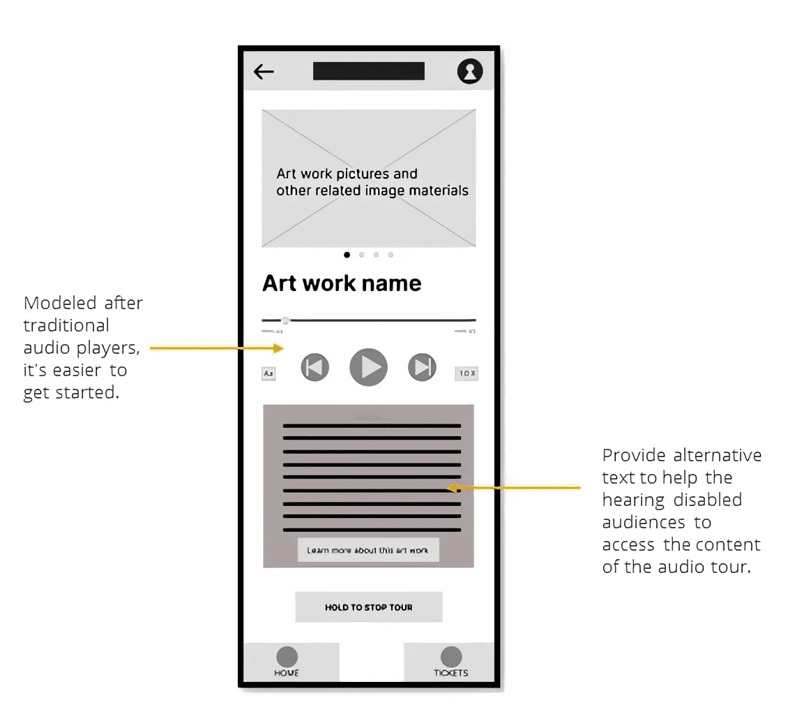
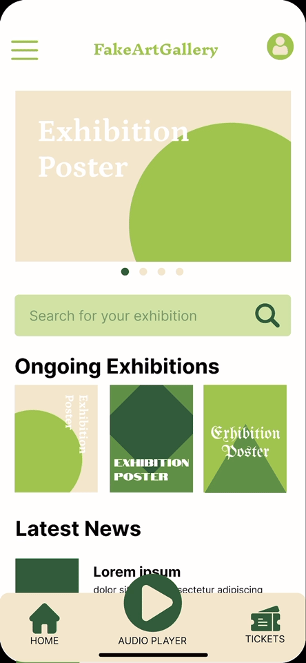
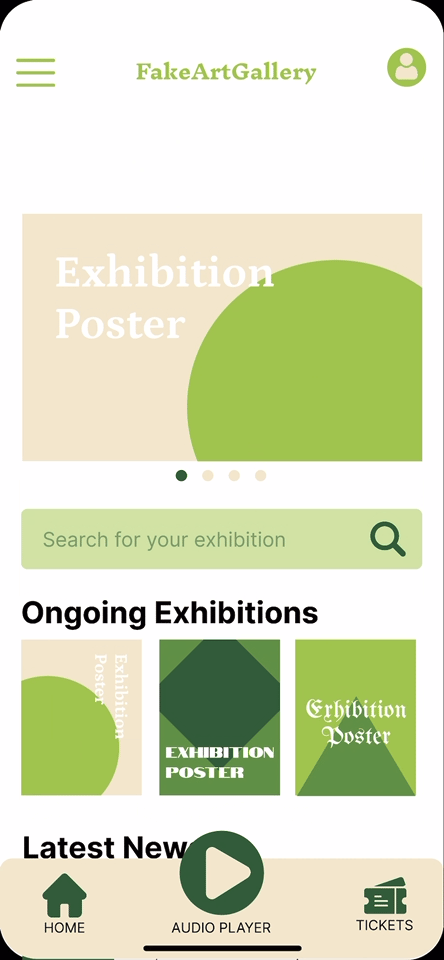
The low-fidelity wireframes showcase two key design features: the Homepage with its search functionality and exhibition display, and the audio guide interface which utilizes familiar player controls while incorporating alt text for improved accessibility.
The low-fidelity wireframes showcase two key design features: the Homepage with its search functionality and exhibition display, and the audio guide interface which utilizes familiar player controls while incorporating alt text for improved accessibility.
User Testing & Insights
User Testing & Insights
I conducted comprehensive user testing sessions for 6 participants with my low-fidelity wireframes, this test was aimed to validate design concepts and uncover potential usability issues early in the development process. Through observation and participant feedback, I identified several critical insights that significantly shaped my subsequent design decisions:
I conducted comprehensive user testing sessions for 6 participants with my low-fidelity wireframes, this test was aimed to validate design concepts and uncover potential usability issues early in the development process. Through observation and participant feedback, I identified several critical insights that significantly shaped my subsequent design decisions:
Key Findings
Key Findings

Based on the valuable insights gathered from user testing, I will now proceed to the next phase of the design process: creating high-fidelity wireframes and an interactive prototype. These refined deliverables will address the critical feedback points identified during testing, including improved navigation cues on the tickets page, clearer contextual information for all interface elements, an accessibility-optimized color palette, and strategic implementation of animations to enhance user interaction. This iterative approach ensures that the final Fake Art Gallery digital experience will be both intuitive and accessible to a diverse audience.
Based on the valuable insights gathered from user testing, I will now proceed to the next phase of the design process: creating high-fidelity wireframes and an interactive prototype. These refined deliverables will address the critical feedback points identified during testing, including improved navigation cues on the tickets page, clearer contextual information for all interface elements, an accessibility-optimized color palette, and strategic implementation of animations to enhance user interaction. This iterative approach ensures that the final Fake Art Gallery digital experience will be both intuitive and accessible to a diverse audience.
Deliver
Deliver
After completing the initial user testing, I iterated on the wireframes based on the feedback given by the participants and worked on the design of a more detailed version: the Hi-Fi prototype.
After completing the initial user testing, I iterated on the wireframes based on the feedback given by the participants and worked on the design of a more detailed version: the Hi-Fi prototype.

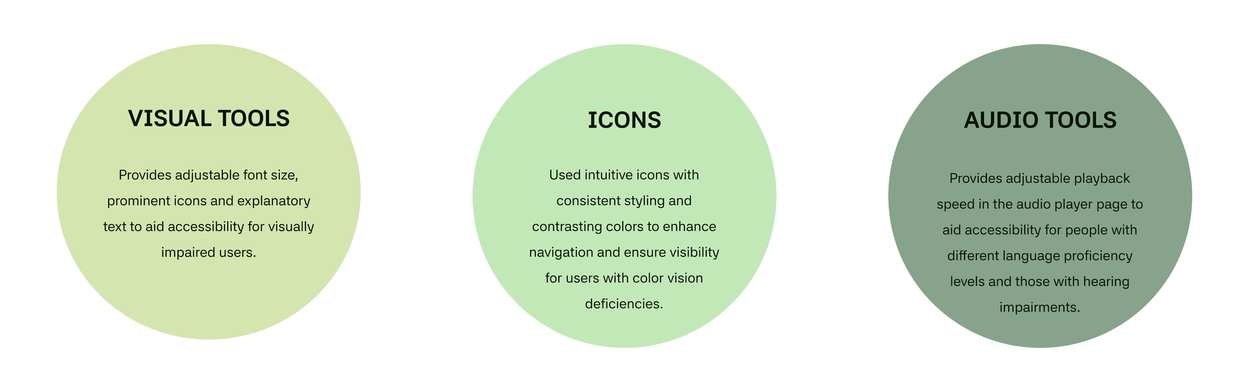
Accessibility Considerations
Accessibility Considerations
Hi-Fi Prototype Showcase
Tickets management
The app allows users to purchase and manage tickets for easy check-in.
Find the interested tour
Using paper tickets? That's okay, users can search for keywords to find the audio-tour they need and access it by ticket serial number.
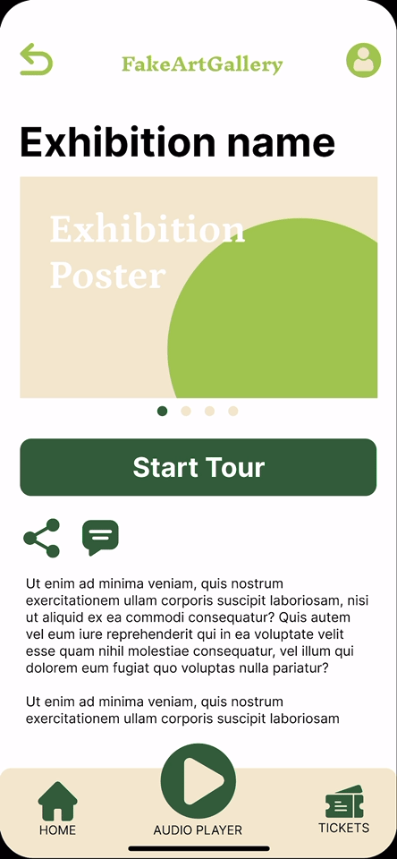
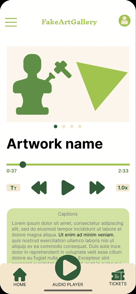
Audio-tour player
The music player interface is used to play the audio-tour. In addition, this feature provides interactive subtitles that make it easy for users to jump to the part they want to listen to.
More accessibility
In the player, we also provide adjustable font sizes and adjustable audio playback speeds to ensure that all users can enjoy their voice journey.
Tickets management
The app allows users to purchase and manage tickets for easy check-in.
Find the interested tour
Using paper tickets? That's okay, users can search for keywords to find the audio-tour they need and access it by ticket serial number.
Audio-tour player
The music player interface is used to play the audio-tour. In addition, this feature provides interactive subtitles that make it easy for users to jump to the part they want to listen to.
More accessibility
In the player, we also provide adjustable font sizes and adjustable audio playback speeds to ensure that all users can enjoy their voice journey.
wrap up
Wrap up

Reflection
Reflection
Use Personas
In this project, I narrowed diverse user groups into two personas: Nancy and Jacob. This transformed abstract needs into concrete design challenges, making it feel like designing for "real person" rather than "users". This approach significantly improved my empathy with users and will remain central to my design process.
Provide Clear Explanations
Low-fidelity wireframe testing revealed confusion about interface elements due to limited detail and participants' unfamiliarity with design conventions. Adding clearer explanations to early prototypes dramatically improved user comprehension, highlighting the importance of clarity even in preliminary designs.
Thank you for reading.
Thank you for reading.
Thank you for reading.
Check out my other case studies below ↓
Check out my other case studies below ↓
© 2025 Shiyi Chen – All Rights Reserved